PREVIOUS EXHIBITIONS
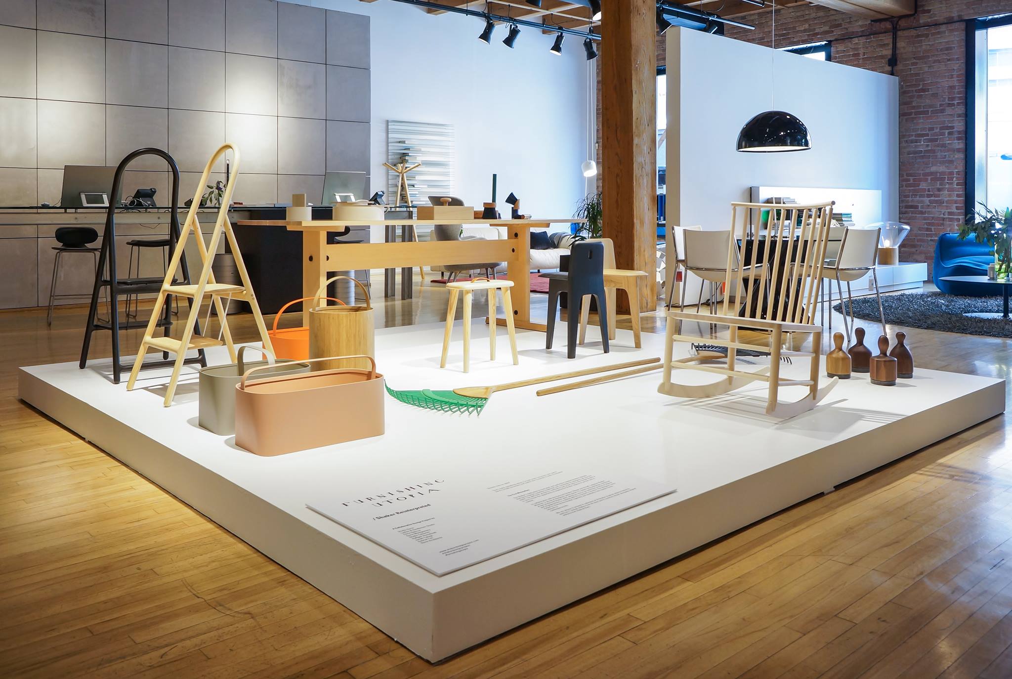
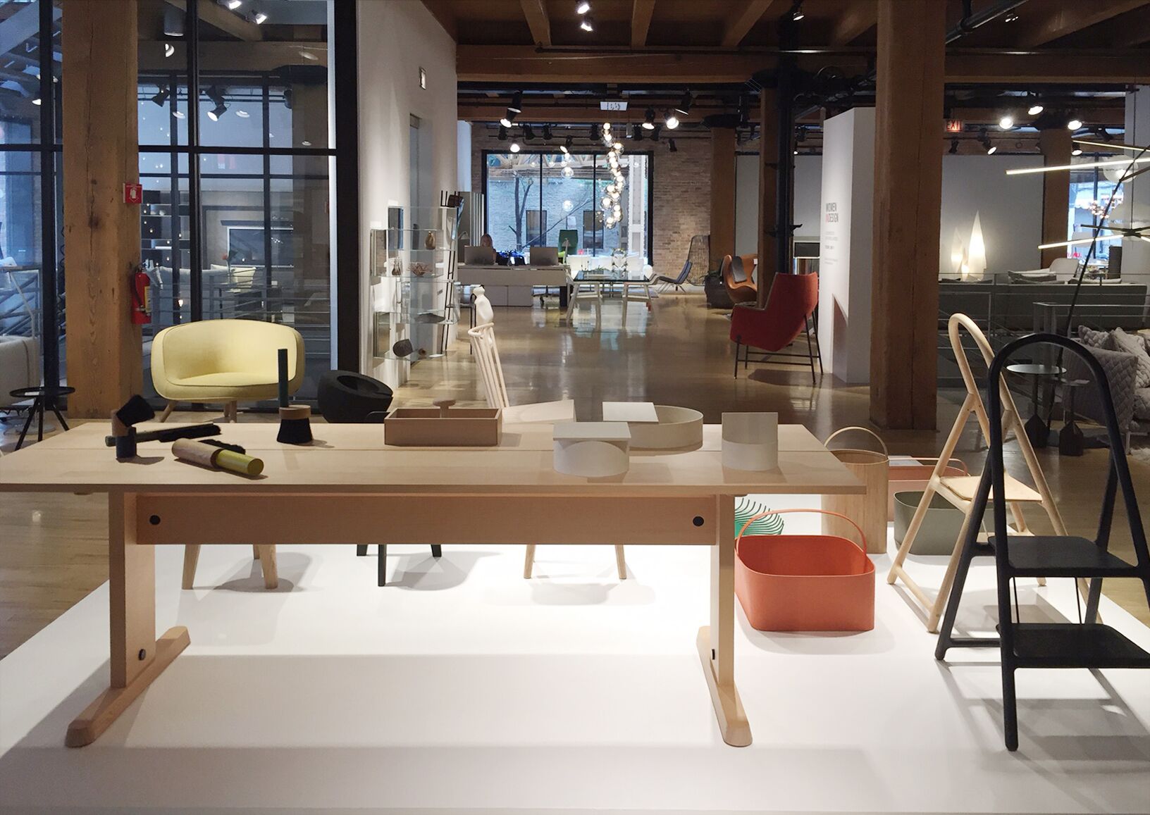
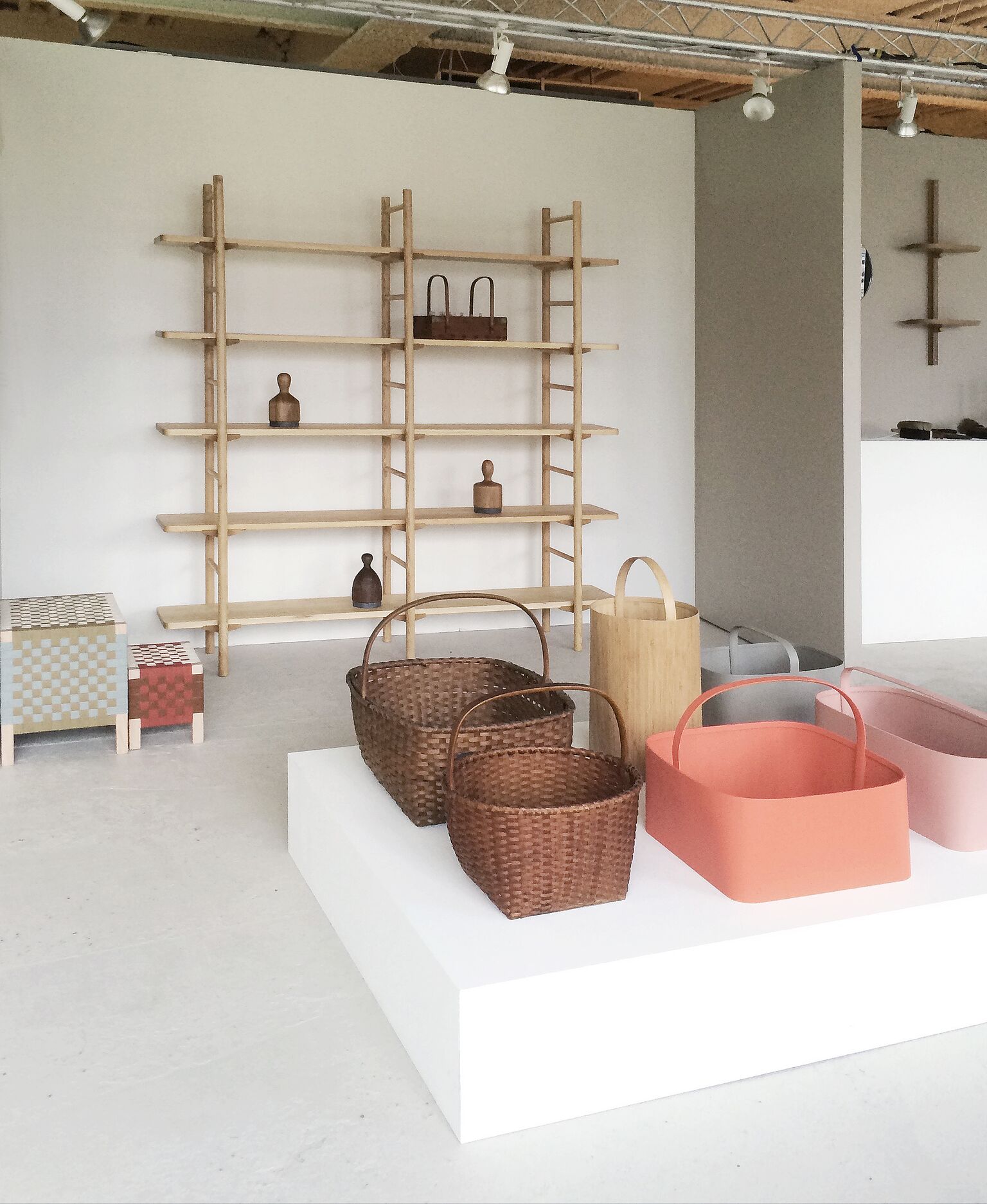
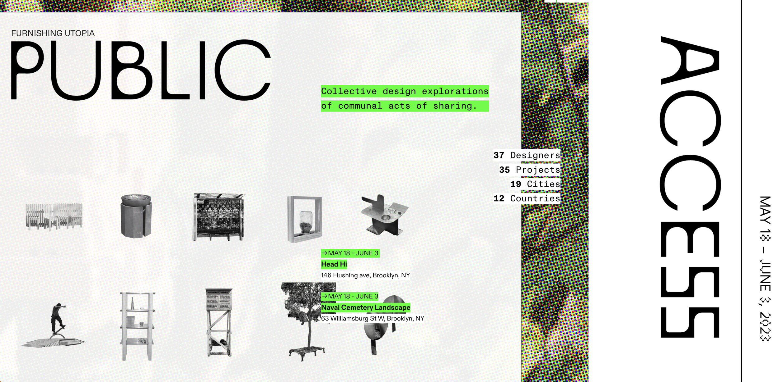
2023 / Furnishing Utopia 5.0
PUBLIC ACCESS
May 18-June 3, 2023
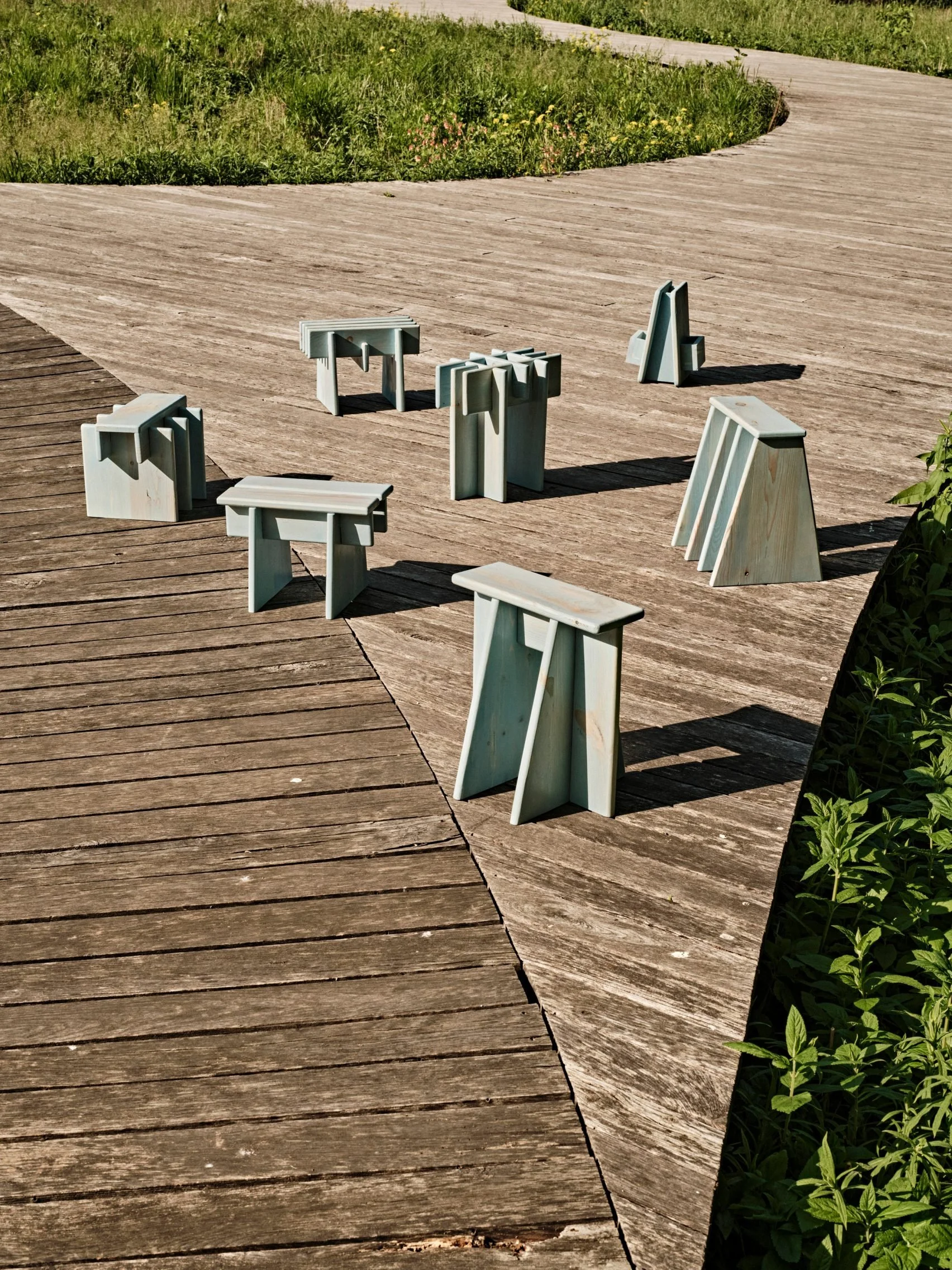
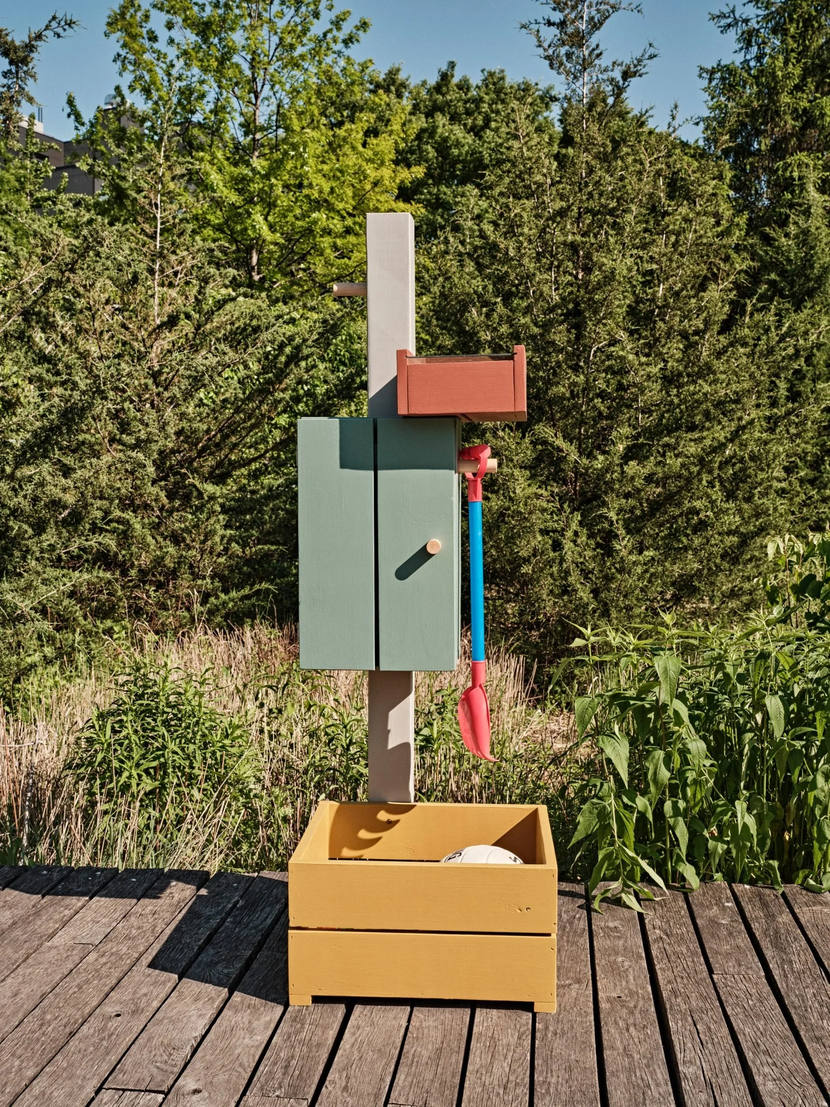
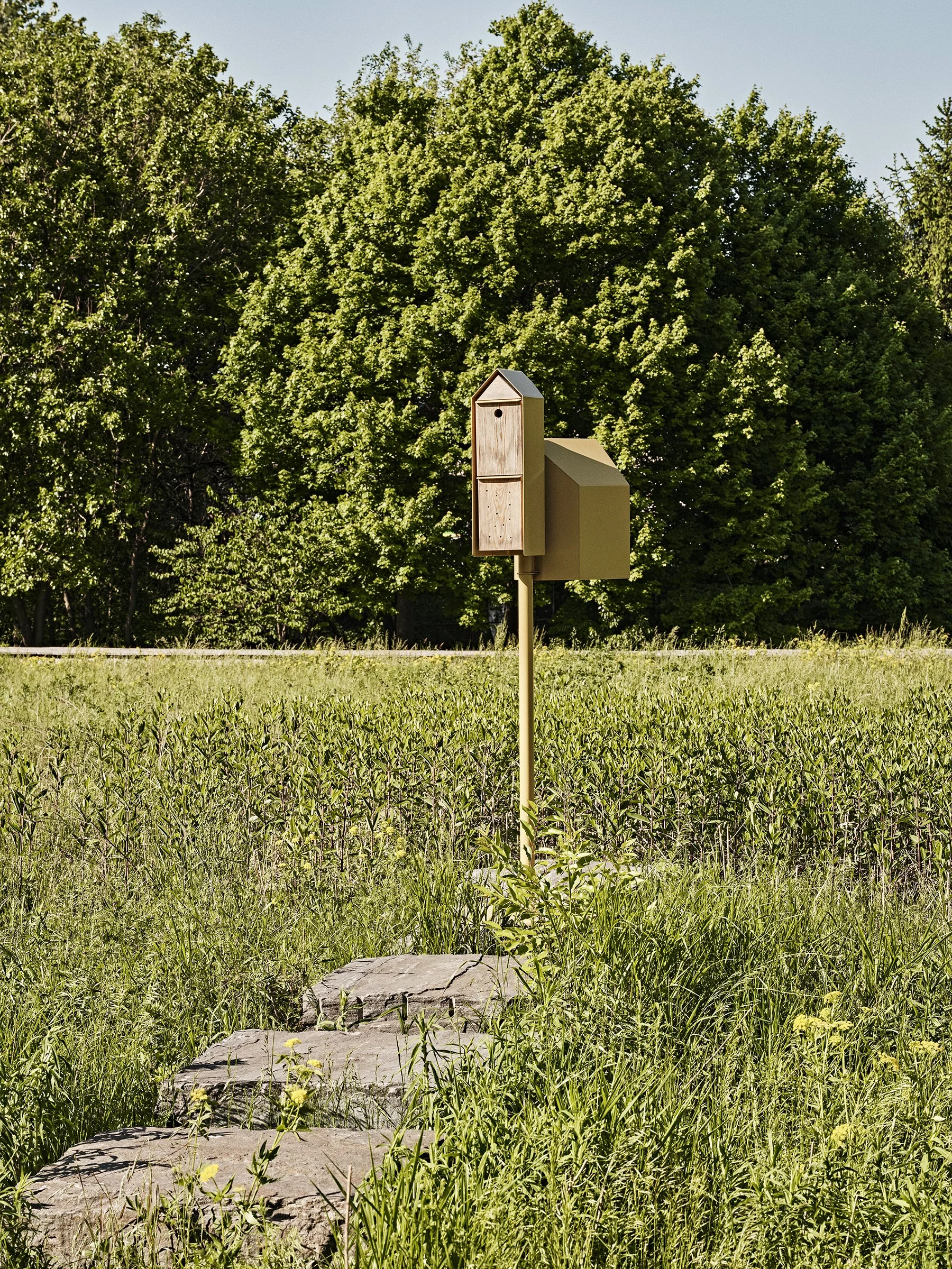
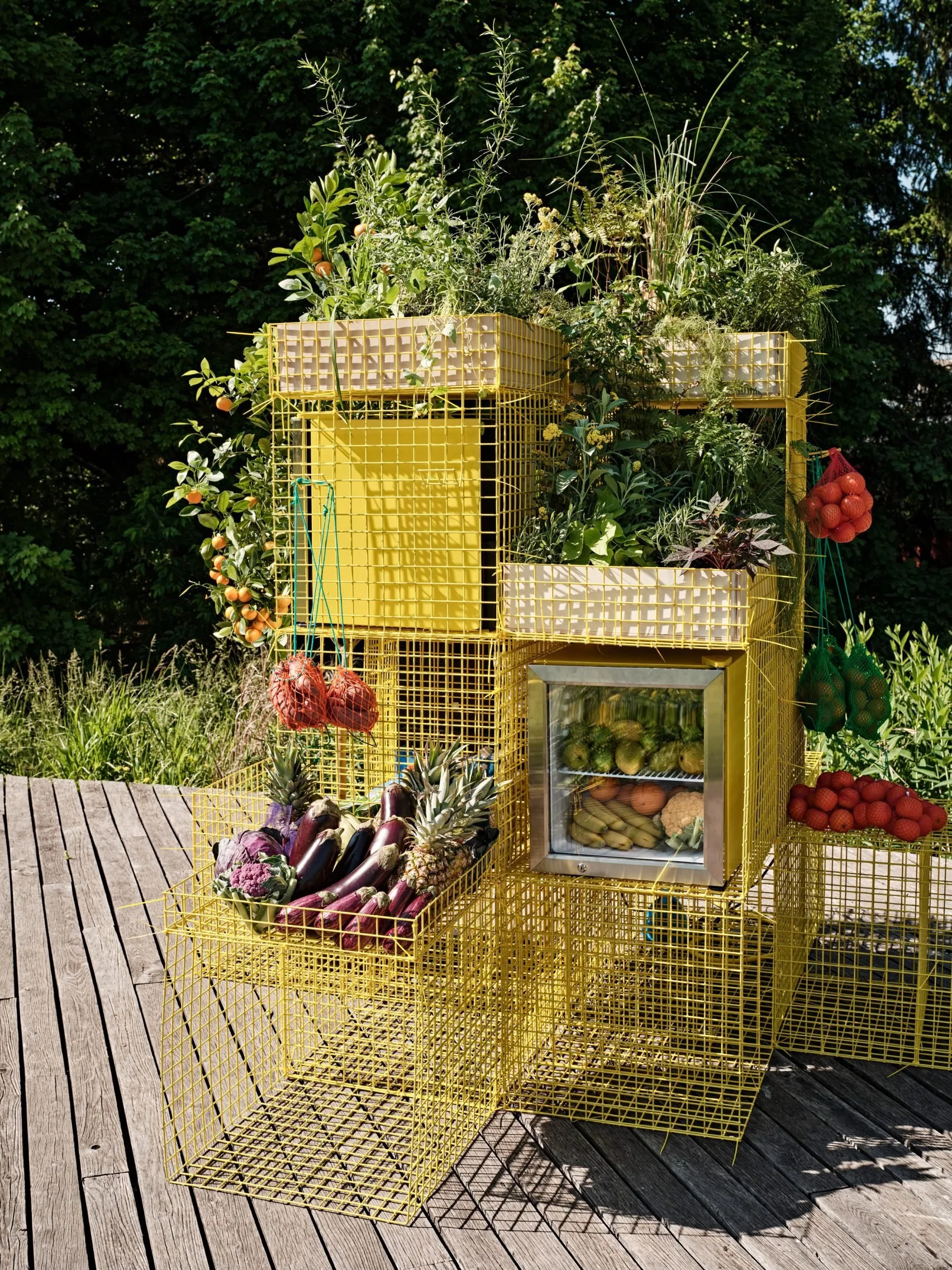
In search of new answers to this question, Furnishing Utopia created an open prompt inviting a group of 39 independent creative minds: Starting with a simple act of presence and noticing, create a public installation that provokes an act of sharing in one’s neighborhood.
The group drew inspiration from the utopian and communal values of the Shakers as well as the counter-cultural DIY movement of the 60’s and 70’s - The Whole Earth Catalog, Enzo Mari's Autoprogettazione, Victor Papanek’s Nomadic Furniture, Ken Issacs’ etc. These past examples represented ideas for democratization of design that Furnishing Utopia aims to rekindle and expand upon.
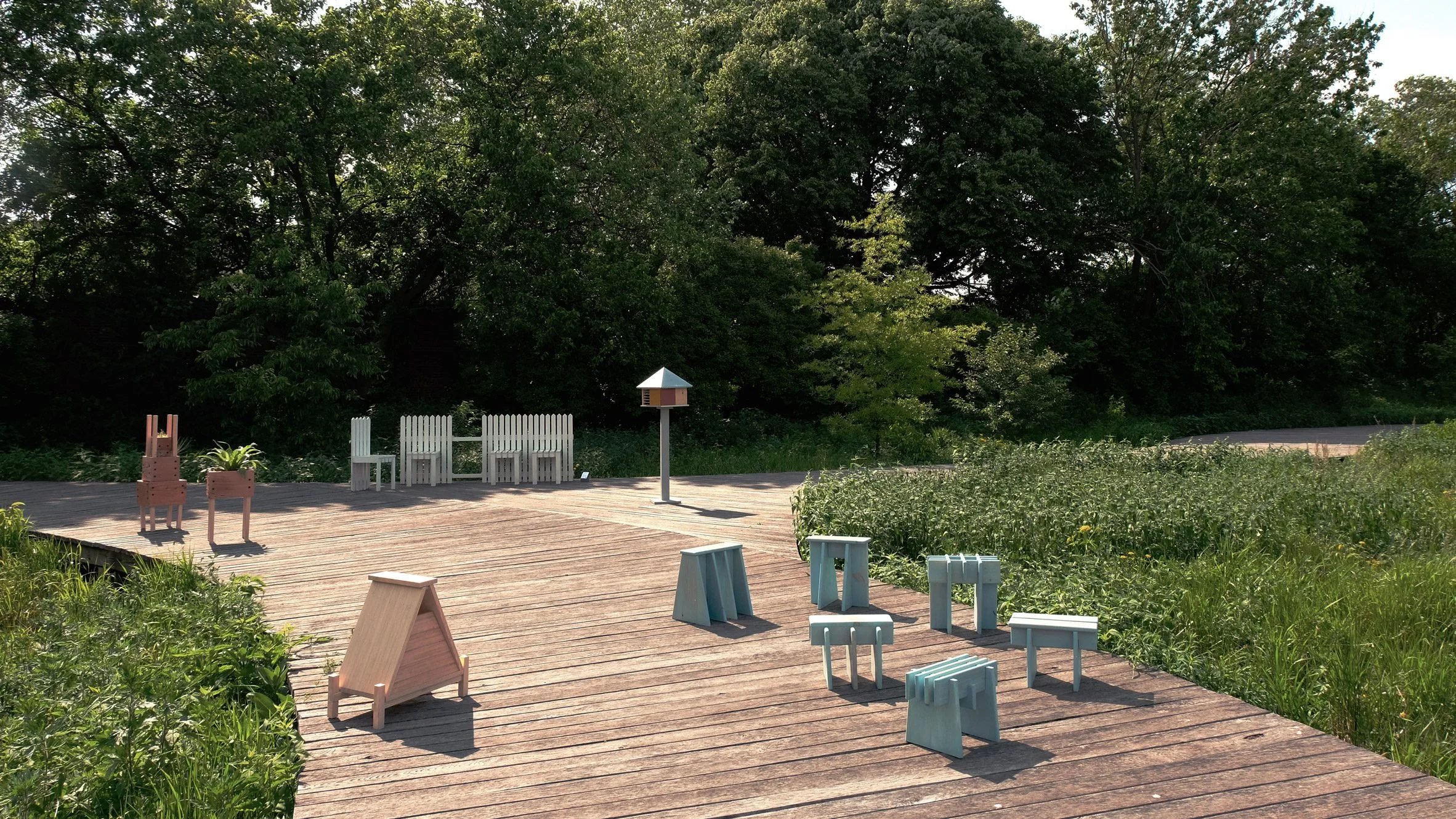
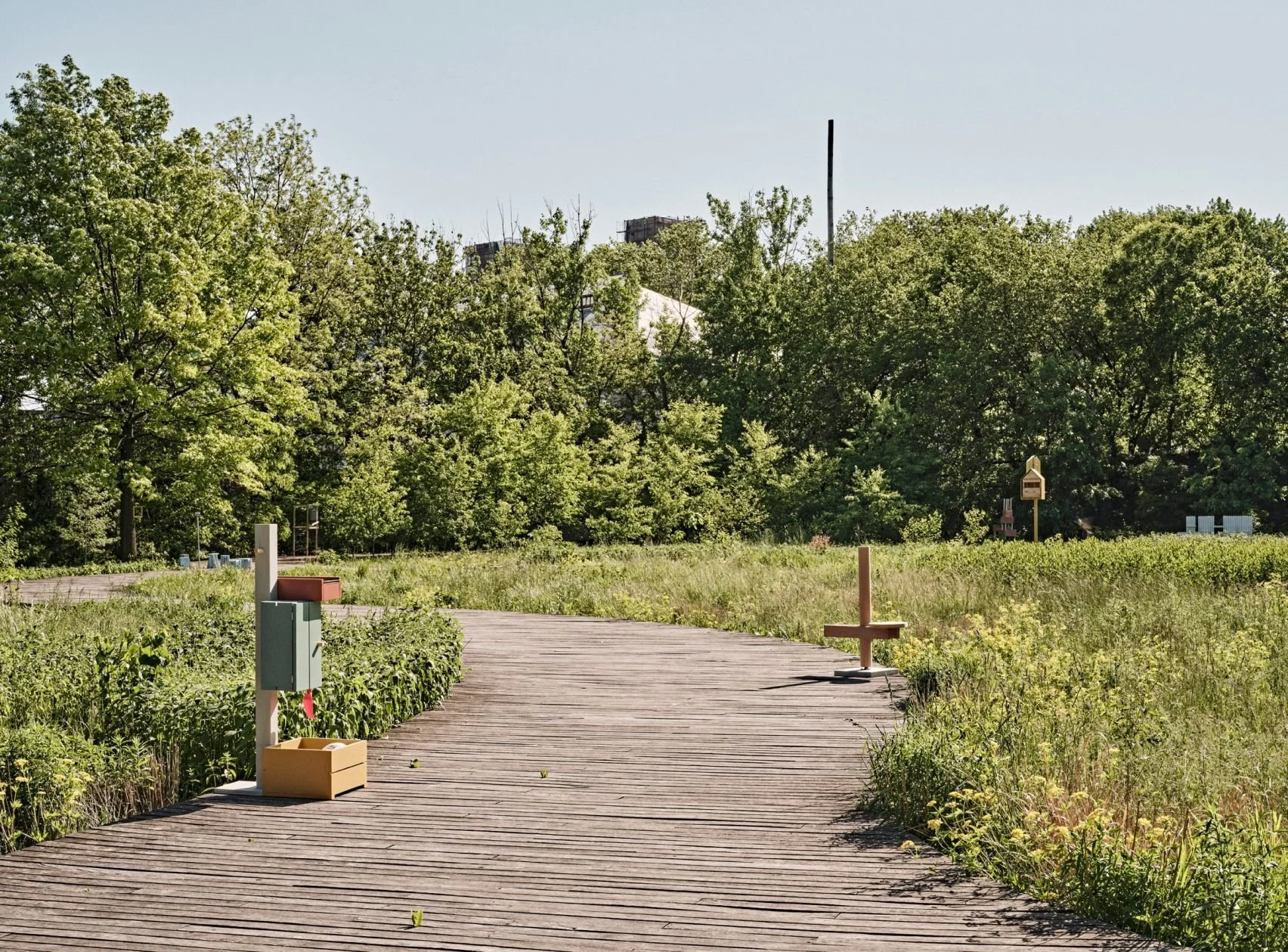
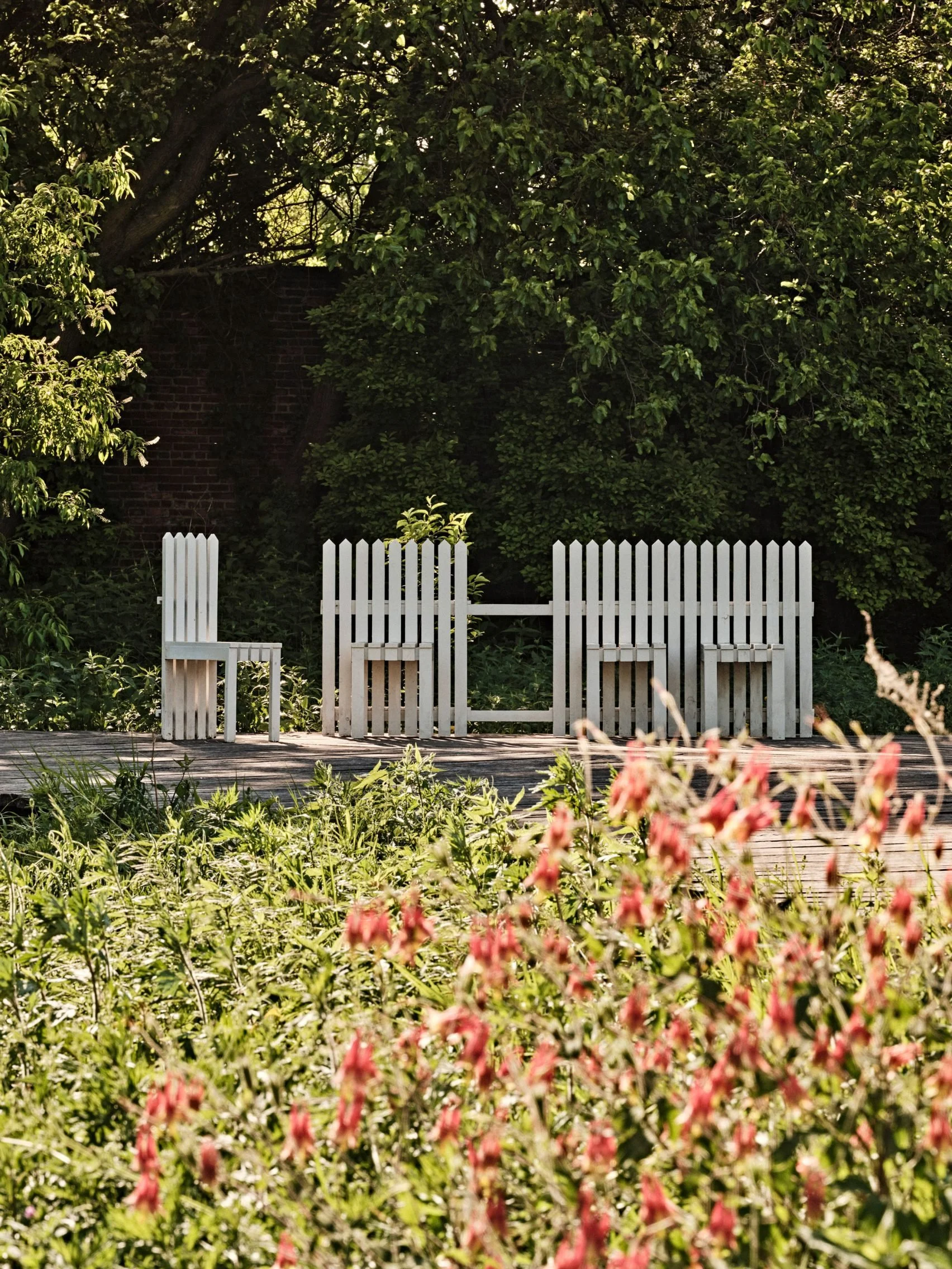
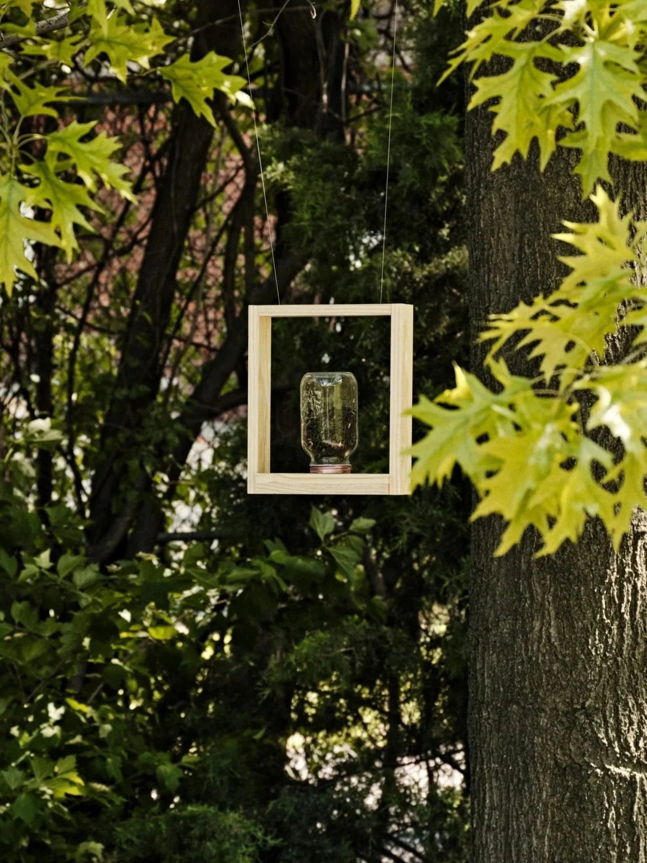
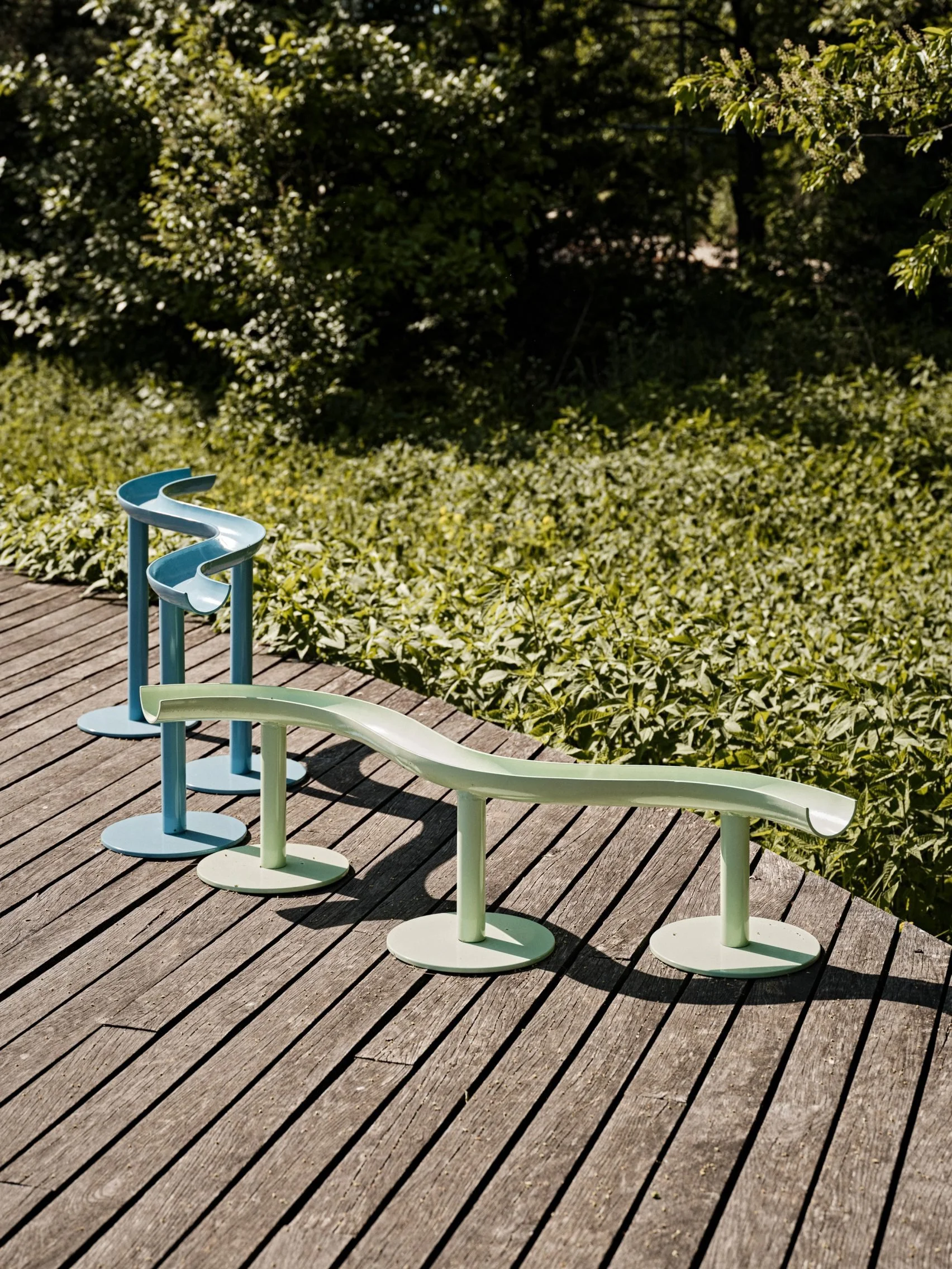
This debut installment of "PUBLIC ACCESS" features works from 39 international designers, from 19 cities, 12 countries exploring ways in which design can inspire communal acts of sharing. The resulting work was exhibited at two sites: An outdoor nature sanctuary at Naval Cemetery Landscape and an indoor bookstore at Head Hi. This project is simple call-to-action and a jumping off point to invite creatives to create an array of offerings designed and built in situ - some sharing community resources, some connecting with nature, or others igniting a sense of wonderment. All respond to their unique locations with an invitation for the public to engage freely.
READ PRESS MENTIONS HERE:
Dezeen / Public furniture design exhibition in Brooklyn highlights "public access not private excess"
Mold Magazine / Public Access-Foreword for the NYDW23 exhibition
An Architect’s Newspaper / NYCxDesign launches today, here are eight unmissable activations

Special Partners and Supporters:
Brooklyn Greenway Initiative / Naval Cemetery Landscape
Norwegian Consulate General New York / Vestre
Exhibit curation and creative direction by Jean Lee of Ladies & Gentlemen Studio
Print & Graphic design: Lulu Wolf
LIST OF PARTICIPANTS: 38 Designers, 35 projects from 19 cities, 12 countries
Kim Thomé (Margate, UK)
Kuo Duo (Seoul, Korea)
Ladies & Gentlemen Studio (Rockaway, NY)
Likeminded Objects x Franny Capone (Hudson, NY)
Loose Parts (Hudson, NY)
Minus Furniture (Oslo, Norway)
Mobile Makers (Chicago, IL)
Mold x Ladies & Gentlemen Studio (Brooklyn, NY)
One Love community x Various Projects (Brooklyn, NY)
Rio Chen (Taichung, Taiwan)
Sina Sohrab (Madrid, Spain)
Space10 x Tanita Klein (Copenhagen, Denmark)
Studio Gorm (Eugene, OR)
Vera & Kyte (Bergen, Norway)
Vestre (Oslo, Norway)
Allan Wexler (Brooklyn/Long Island, NY)
Altimeter (Brooklyn, NY)
Bravo Studio (Santiago, Chile)
Boym Partners, Inc (New York City, NY)
Chiaozza (Brooklyn, NY)
Daniel Michalik x BBSC x Nina Cinelli (Brooklyn, NY)
Earnest Studio (Rotterdam, Netherlands)
Erik Eje Almqvist (Gothenburg, Sweden)
Fin (Seattle, WA)
Grain (Seattle, WA)
Jonah Takagi x Pete Oyler (Brooklyn, NY / Chicago, IL)
Jonathan Nesci (Columbus, IN)
Jorge Diego-Etienne (Monterrey, Mexico)
Kaarem (Saigon, Vietnam)
Kazuki Guzmán (Chicago IL)